
September 10, 2026
See It in Color Before You Kill the Color
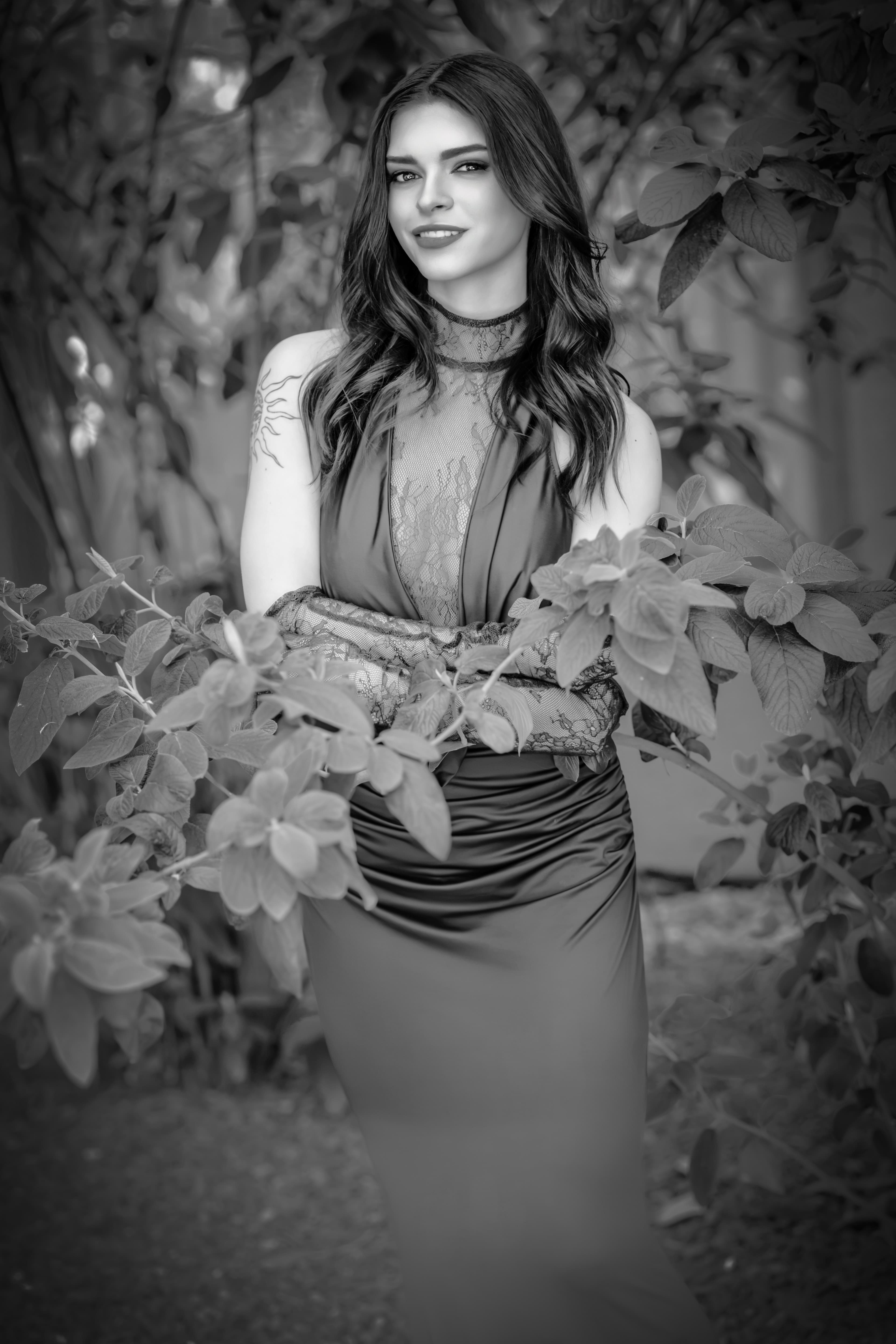
Sometimes a photograph tells you what it wants to be, but not immediately. Sometimes you have to live with it for a minute.
I had a color portrait from Shutterfest 2026 that I liked. The light was doing what I wanted. The skin had warmth. The lace had texture and delicacy. There was softness in the pose without the image feeling weak, and her expression had that little bit of confidence and stillness that made me keep looking at it. The color version worked. The question was whether color was helping the photograph say what I wanted it to say, or whether it was simply one more thing asking for attention.
That is where the black and white conversation started. Not with a preset or a button, but with the photograph.
Before I Take the Color Away, I Want to Know What It Is Giving Me
The color photograph was already doing a lot of things well. Her warm skin sat against the burgundy of the dress, surrounded by layers of green foliage and cooler tones farther back in the frame. The colors gave me separation almost for free.
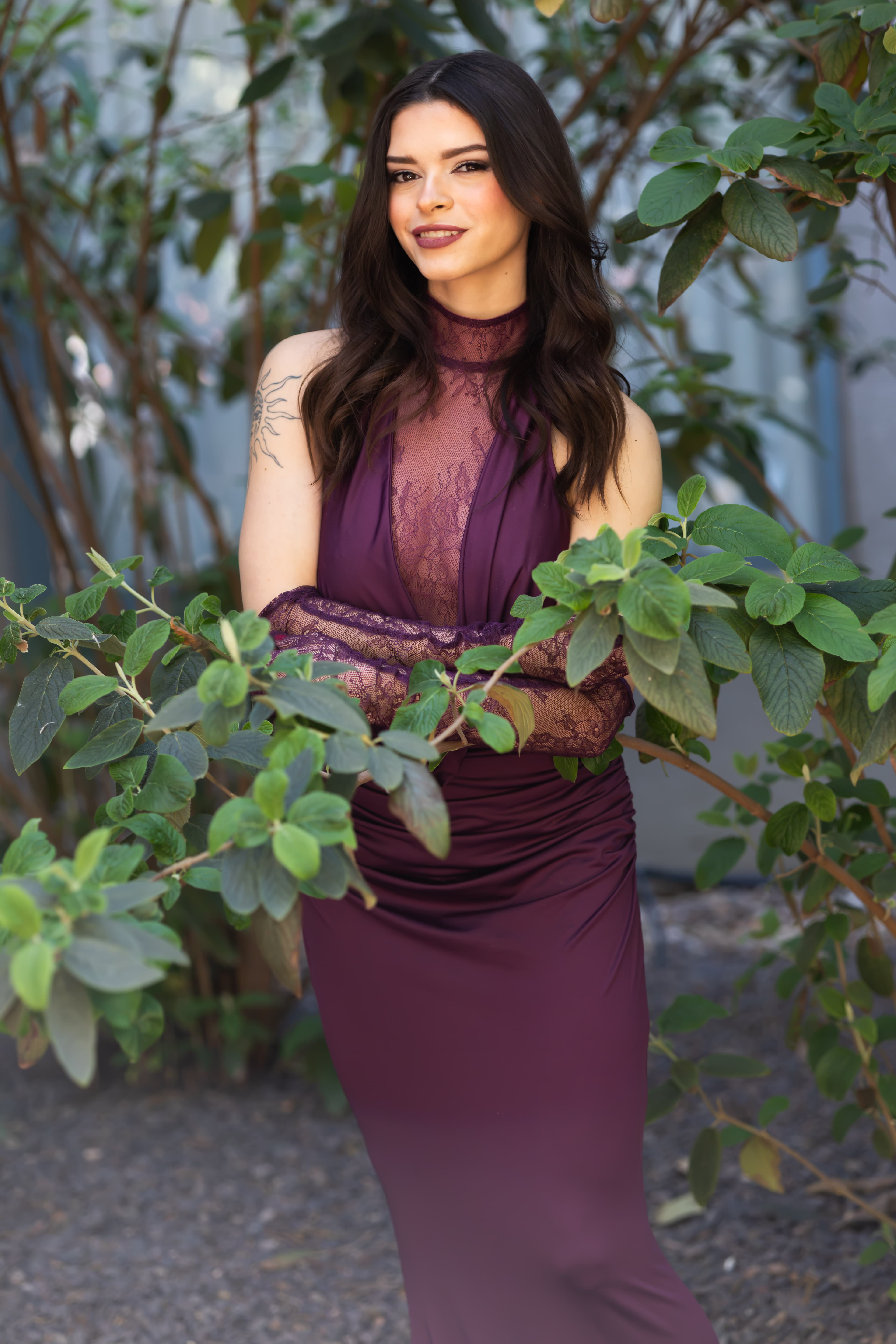
Before converting anything, I want to understand what I would be giving up. In this photograph I cared about the softness of the skin, the shape created by the light, the delicacy of the lace, the transitions through the shadows and, most of all, the expression. Black and white drama by itself does not improve a photograph. If I lose the suppleness of the skin, bury the lace, flatten the face or make the light too aggressive, then I have not improved anything. I have just made it monochrome.
The Photograph Still Has to Feel Good
Photographers can get distracted by channels, curves, black points and contrast and forget that the image still has to feel like something. I want skin to have life. I want the light to move across the body. I want lace to remain soft, fine and dimensional instead of becoming a hard white shape. I want shadow detail where I need it and darkness where it helps the photograph. I want the transition from highlight to shadow to feel natural. And I want the expression to remain the reason you stay with the image.
Technique serves those priorities. Not the other way around.
Then I Start Looking at Tone
Once I know what I am trying to protect, I start considering how the photograph will behave without color. Where are the deepest shadows? Where are the brightest highlights? How much separation exists between skin and lace, between the dress and the body, between the subject and the foliage? Which areas are being separated mostly by hue rather than brightness?
That matters because red and orange information in the skin can later control how bright or dark that skin becomes. Greens in the foliage can be moved independently. The burgundy dress can become a completely different tonal value depending on how those channels are translated. Two things that look clearly different in color can collapse into nearly the same gray if I am not paying attention.
Once I began thinking about the photograph in black and white, the color safety net disappeared. Skin needed to remain supple. Lace needed to stay delicate. The smoother fabric of the dress needed enough tonal difference that it did not become one flat shape. Her dark hair needed separation without turning into a solid mass, and the foliage still had to frame her without fighting for attention.
Black and White Does Not Fix a Color Problem
I also look for things like mixed light, green bounce, magenta in the skin and chromatic aberration before I convert. Black and white does not suddenly make the underlying color information irrelevant. Some of it disappears visually, but the channel relationships still affect what happens when I begin mixing tones.
If something needs correcting, I would rather deal with it while I can still see the cause. I am not trying to make a perfect color photograph just so I can throw the color away. I am preparing the file for the interpretation I actually want to make.
Then the Color Can Go
When I finally convert, I want control over the original color channels. A Black & White adjustment layer in Photoshop or the Black & White Mix in Lightroom lets me decide how reds, oranges, yellows, greens, blues and other colors translate into gray. That means I can protect the skin, let the background fall away, hold detail in the lace and create separation selectively instead of simply throwing global contrast at the whole photograph.
Global contrast is easy. Selective contrast is where the photograph starts becoming yours. Sometimes the skin needs to stay open while the background comes down. Sometimes the lace needs a little more presence. Sometimes the face needs almost nothing because the light already did the work. I am not moving sliders for drama. I am trying to preserve the things that made me stop on the image in the first place.
Why This One Became Black and White
The color version was good. I could have finished it there. But the things I cared about most did not depend on color. They were shape, light, skin, texture, lace, expression and the quiet relationship between highlight and shadow.
Most important was her expression. Take away the burgundy and the greens and there is less between the viewer and her face. Her eyes, the slight smile and the quiet confidence in the pose begin carrying more of the photograph. That was when I knew the conversion was giving me something rather than simply taking color away.
The photograph felt quieter and more intimate. The lace became more about texture against skin. The light became more obvious without becoming louder. The skin could remain soft and alive. Her expression carried more weight because there was less competing with it. At that point, black and white stopped being an effect and became the interpretation I wanted.
And Eventually, It Has to Become a Print
For Photography Fit 2 Print, that part is literal. I do not consider the photograph finished simply because it looks right on a monitor. A black and white image can fool you on a bright screen. Shadows can look richer than they will on paper. Tonal transitions can disappear. Lace separation can vanish. Skin that looks luminous on a backlit display can print too dark if the midtones are not carrying enough information.
The print gets a vote. I want to see whether the light still moves the way I intended, whether the skin retains its suppleness, whether the lace remains lace instead of becoming a block of white, whether the blacks have weight without swallowing the photograph, and whether her expression is still the first thing that holds me. If the print says no, I go back. That is part of the craft.
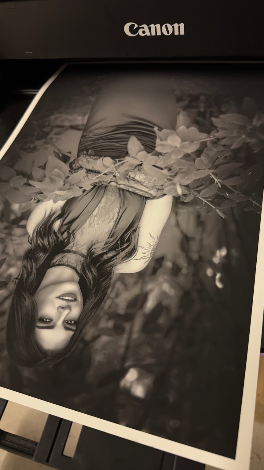
The camera gave me the photograph. The color file gave me the information. The black and white conversion gave me another interpretation. The print tells me whether I actually finished the job. That is why I try to see the color before I kill it.
Model: Alec Reichert / Instagram: @lexxluma
Fit to capture. Fit to curate. Fit to print.
Ready To Be Seen?
Sessions are booking now for 2026. Let's make something bold together.
Get In Touch